Ford is rolling out a new infotainment system called the Ford and Lincoln Digital Experience that aims to fix many of the sins of modern in-car technology. Hopefully our readers don’t all roll their eyes at the same time after reading the words “Digital Experience” and seeing not one but two screens. A collective eye roll that large might be enough to tilt the Earth into a mass extinction event. Then we’ll have to start the whole evolution process over again to get back to where we are today. No, instead, let’s check to see if it’s any good.
First Things First
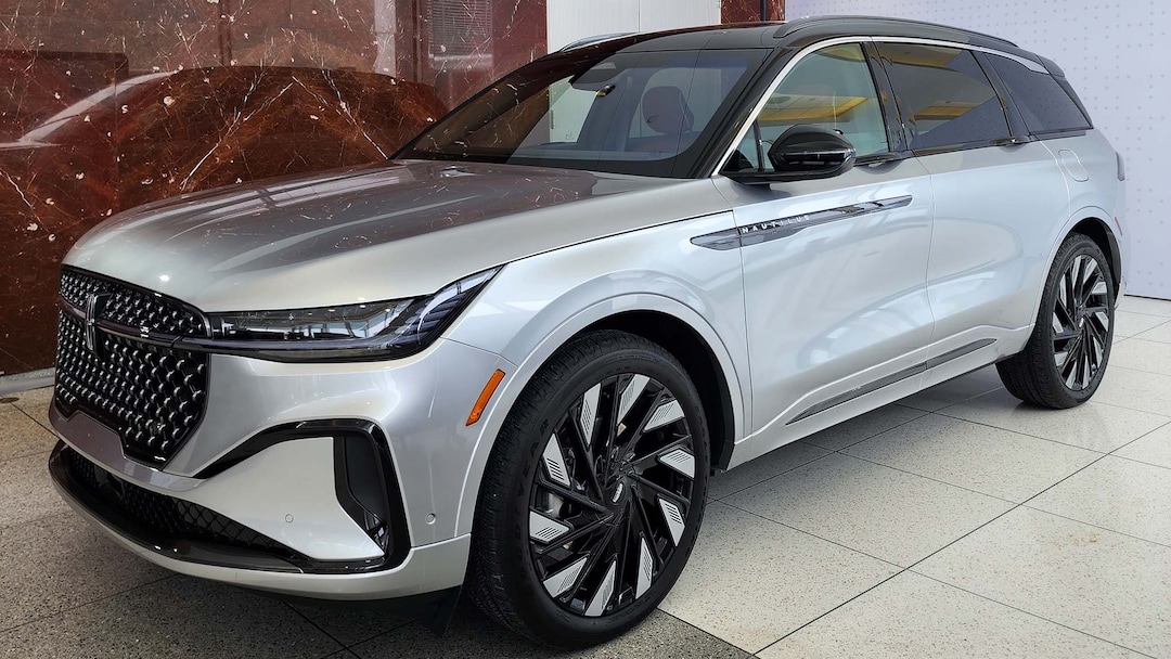
The first vehicle to feature the new system is the 2024 Lincoln Nautilus SUV with its 48-inch 4K panoramic display and a much smaller 11.1-inch touchscreen in the center. The underlying hardware has better main processing, better graphics processing, more memory, and more storage than current versions of Sync 4. From the limited time we’ve spent with it so far, we can say the interface works well, and screens and features load quickly with smooth touch operation and clear graphics.

We don’t yet know what Ford vehicle will be first with the Digital Experience, but integration into other vehicles should be better than before. To keep the experience consistent across the brands, each vehicle engineering team will select hardware components curated by the digital entertainment team instead of reinventing the wheel every time. There will be differences, though, as it’s unlikely all vehicles will get the Nautilus’s massive display.
We saw a demonstration display for a Ford vehicle with a more traditional digital gauge cluster and 13.2-inch touchscreen. We imagine implementing a panoramic screen like the Nautilus will take some time to physically make it into most vehicles due to significant interior updates, but even with more conventional hardware, the software should still give consumers a better experience in the short-term.
Critical, Supportive, Glanceable
The Ford and Lincoln Digital Experience isn’t necessarily trying to give us less data in our cars and trucks but strives to organize it better. The approach by many automakers has been to give consumers something they are familiar with—oversized smartphones attached to a car—and that hasn’t always yielded the best results. As technology continues to improve, studies by J.D. Power suggest that customer satisfaction with infotainment systems is declining because they are getting too complex.

So how is a massive panoramic display controlled by a secondary touchscreen less complex? It comes down to execution. First, the panoramic screen is only a display. It is recessed—literally less in-your-face than a giant tablet—and positioned in the driver’s sight line like a head-up display. The display is virtually divided into what Ford calls Critical, Supportive, and Glanceable zones.
The Critical zone on the far left includes real-time vehicle metrics like speed and the status of the BlueCruise hands-free driver-assistance system. The Supportive zone places navigation to the right, but still positioned near the driver’s direct line of sight. Together, they make up what might be the space a traditional gauge cluster takes up. The Glanceable zone on the right is the largest, with customizable widgets to display weather, music, tire pressure, and other information that might be of interest but is not mission critical.
What Features Does It Have?
The Ford and Lincoln Digital Experience is a complete suite of just about every modern infotainment system. It runs on the Android Automotive operating system with Google Assistant and Amazon Alexa Built-In available as native voice assistants. Wireless phone projection with Android Auto and Apple CarPlay are both available. A Wi-Fi hotspot and 5G connectivity plan are available to make the best use of apps from the Google Play store or a paired phone. You can even stream video or play games like Ford’s version of Asphalt Nitro 2 with a Bluetooth-enabled controller—good ways to kill time when charging an electric vehicle.

There is a ton this infotainment system can do, and recounting every detail will make it seem a lot more complex than it is. What really stands out is how everything is laid out and how the driver interacts with the vehicle. That doesn’t sound very exciting, and ergonomics usually go unnoticed at a conscious level, but these are the details that irritate us the most. Ford’s newest infotainment system really seems to be a good step in the right direction towards implementing the software-defined future in a simple way.
For example, there is constant debate about digital and physical controls. Designers claim consumers don’t want physical controls, while most car buyers we talk to insist that they do. It’s often an all-or-nothing approach, but Ford carefully selected some key physical controls to keep in the Nautilus. The climate controls are digital—available in an always-visible ribbon at the bottom of the touch screen—but there is a button on the center console to jump straight to max defrost on those cold mornings.

There’s a button to access the cameras, too, and the view can be selected on the touchscreen while the feed is visible on the panoramic screen. Now you can watch the camera while keeping your eyes closer to the physical world. Drive mode selection is available in this cluster of six buttons, along with the hazard lights, auto start-stop, and parking chime for those times when you know the sensor is blocked and don’t need the warning.
Another feature we liked was the control for the air vents. They can only be controlled through the touchscreen, but presets are available for each vent position—where it’s blowing, and which ones are open. These settings can be loaded into each driver’s profile, so they don’t have to be physically reset each time. Features like this show actual thought and effort into removing the steps it takes to complete tasks.
Final Thoughts
Life in the modern connected world teeters on the edge of information overload every day and the flood doesn’t seem to be slowing down. After grabbing your phone first thing in the morning to shut off an alarm, check a few different email accounts, and clear notifications from who-knows-how-many social media accounts you couldn’t get to last night, you can calmly find solace in your morning drive—as a tablet the size of the computer screen you stare at all day glares back at you from the center of your car.

The Ford and Lincoln Digital Experience is moving in the right direction. Driver actions have been streamlined, and the large panoramic screen lets relevant information remain visible, meaning less reaches toward the touch screen. We look forward to spending more time with the Nautilus and vetting the system in depth, but it seems promising on first glance.


